Nohlab
Nohlab is a studio, focused on producing interdisciplinary experiences around art, design and technology.
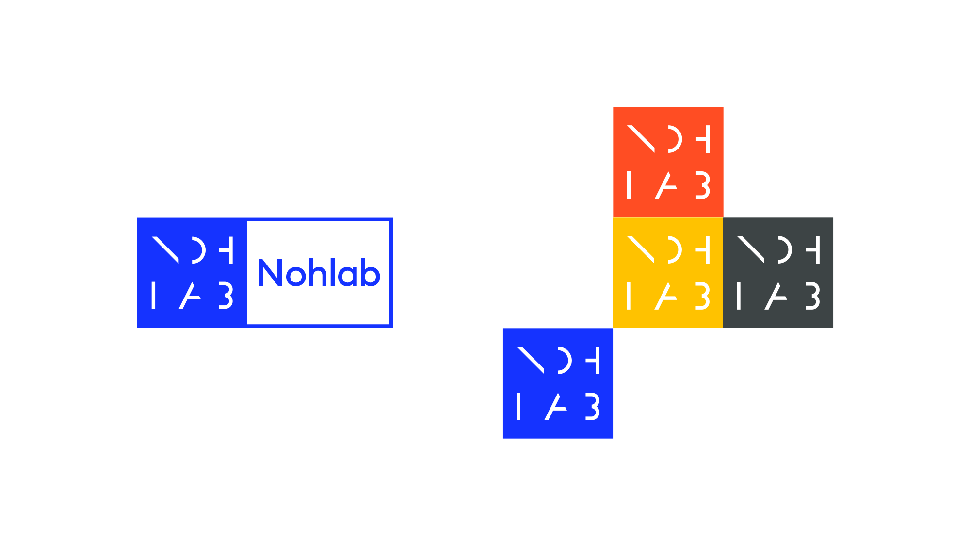
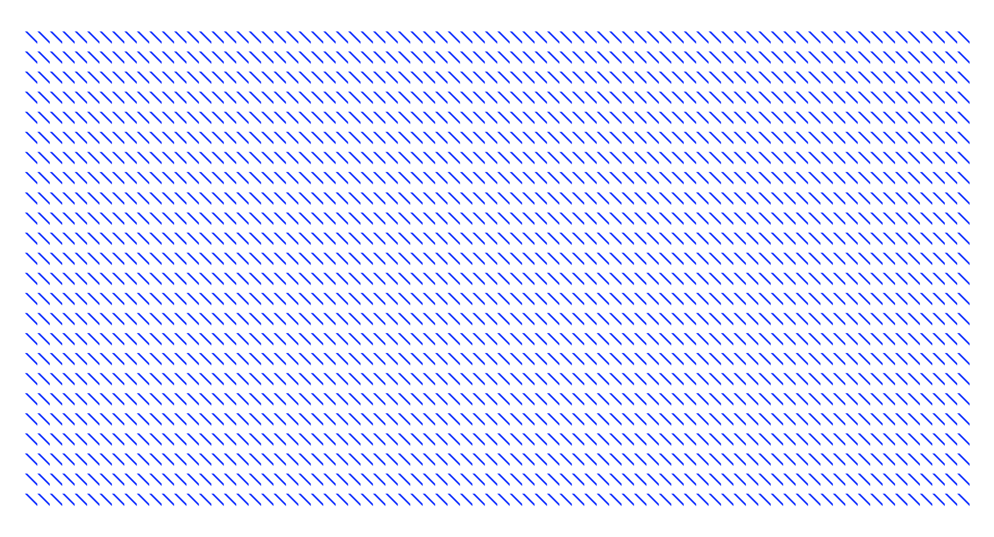
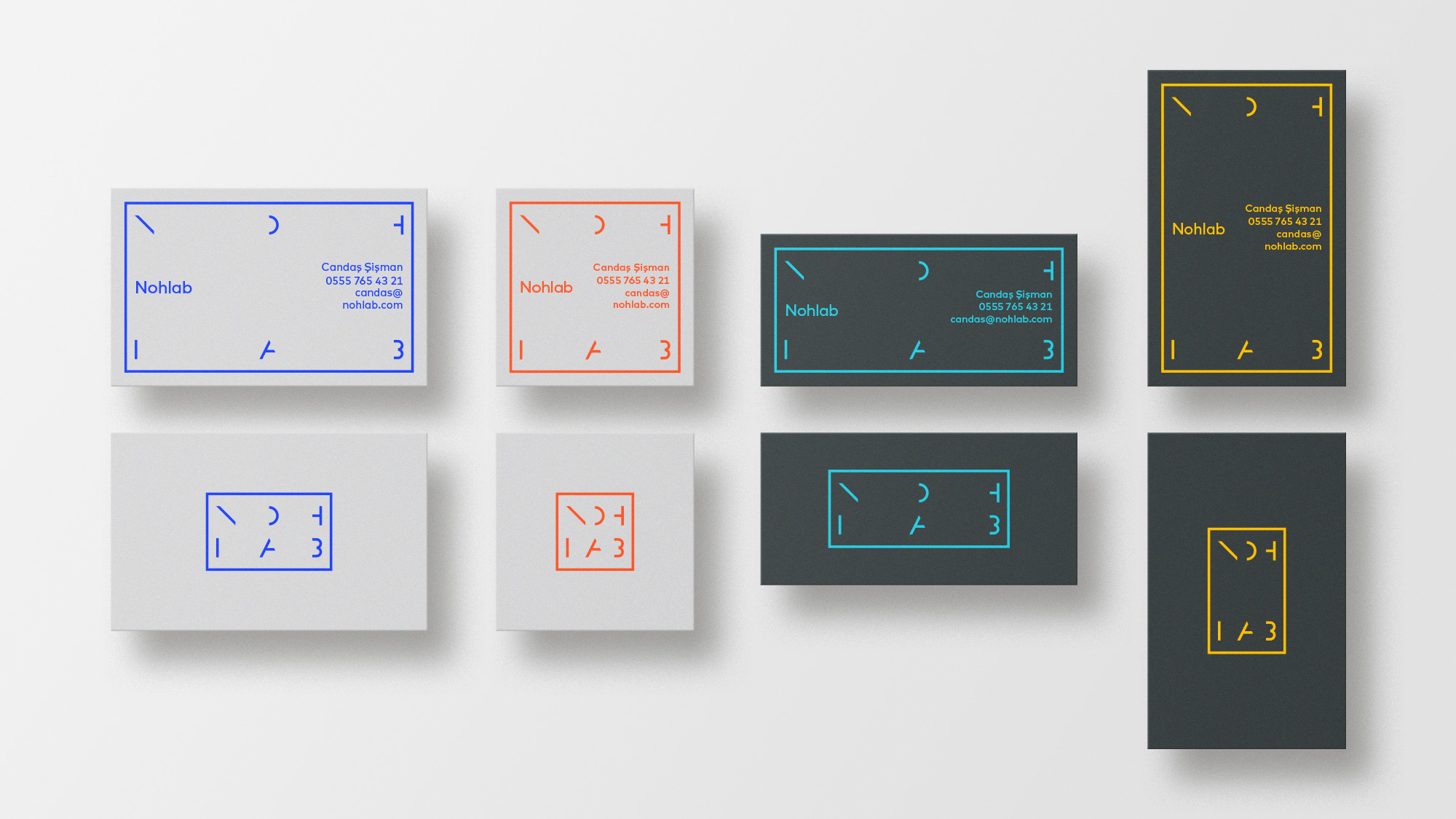
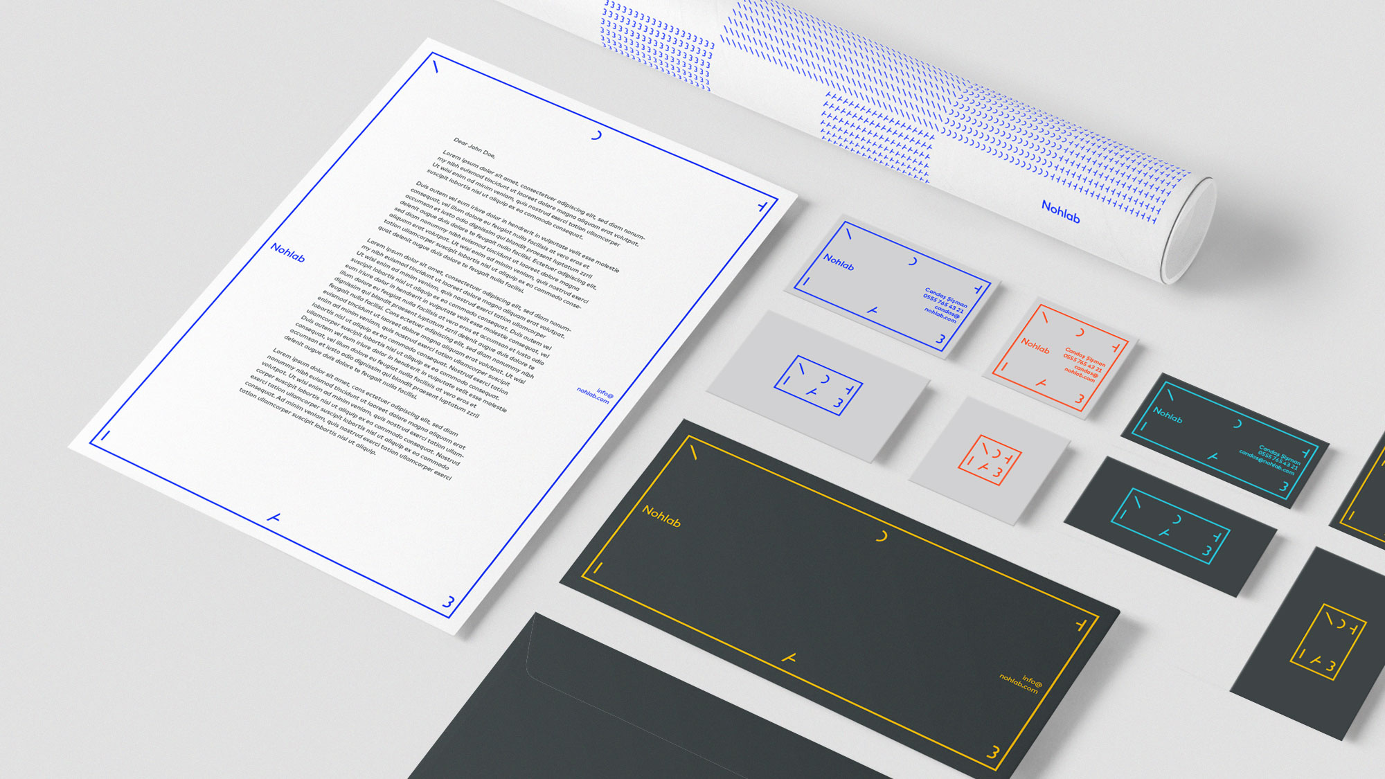
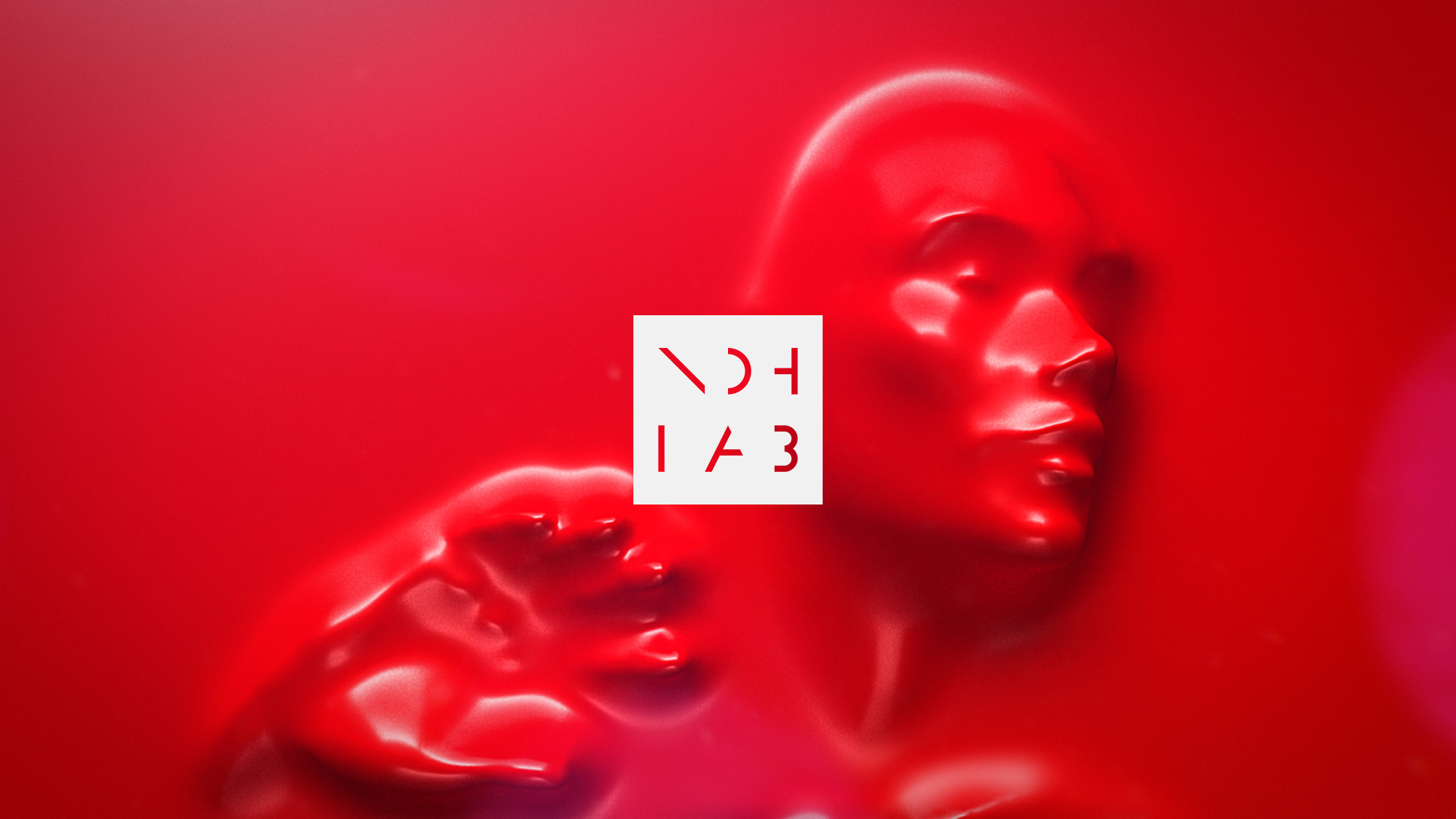
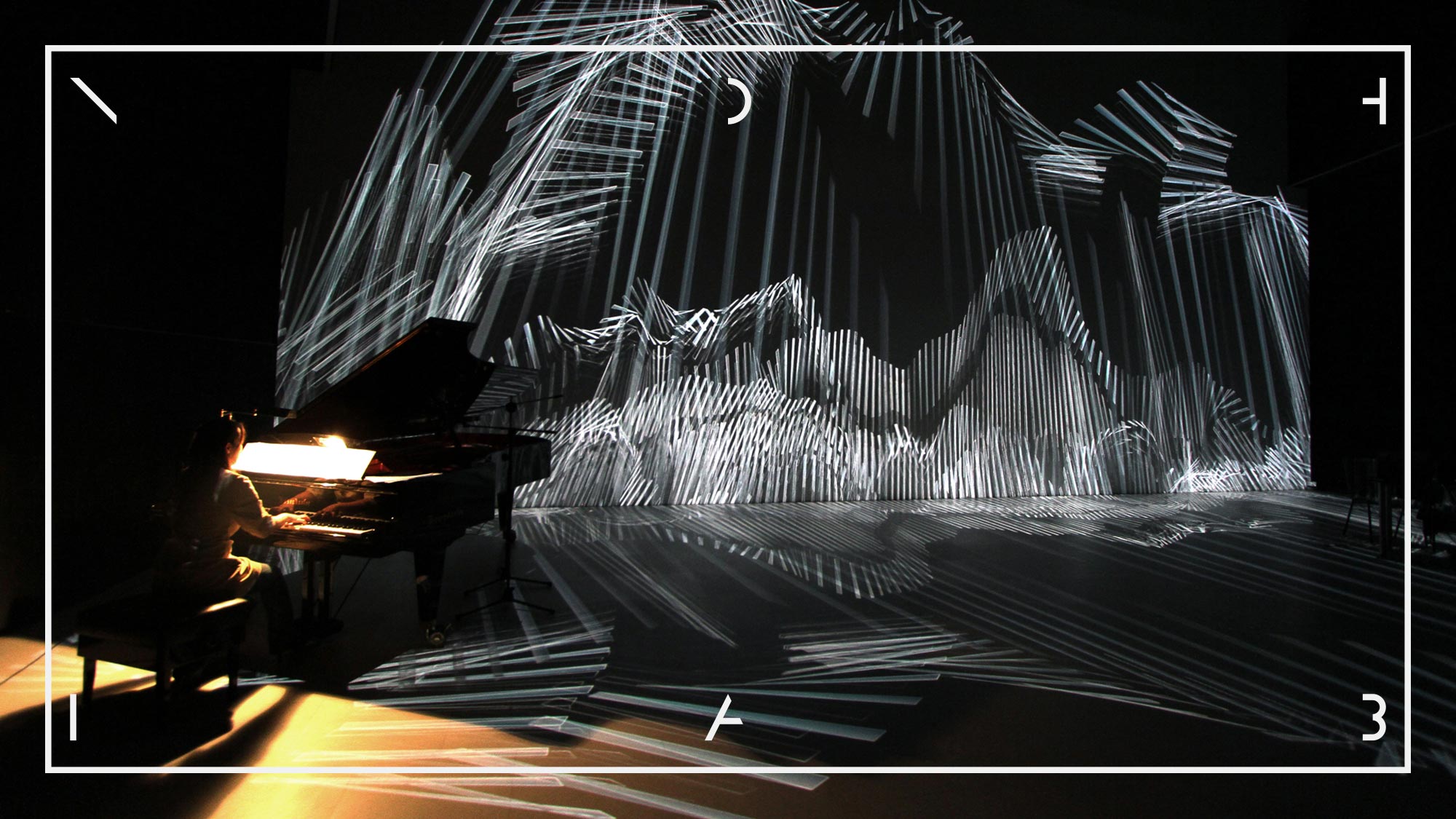
The main starting point for the Nohlab branding was the strong geometric elements and patterns they used in their projects, and the dynamism of their work on different areas and surfaces. Inspired by their work for various mediums, the logo also positions itself, reshapes and gains a dynamic identity. It does this through keywords, such as screen, frame and trace.
Client
Nohlab
Industry
Creative Agency
Services
Branding
Year
2017
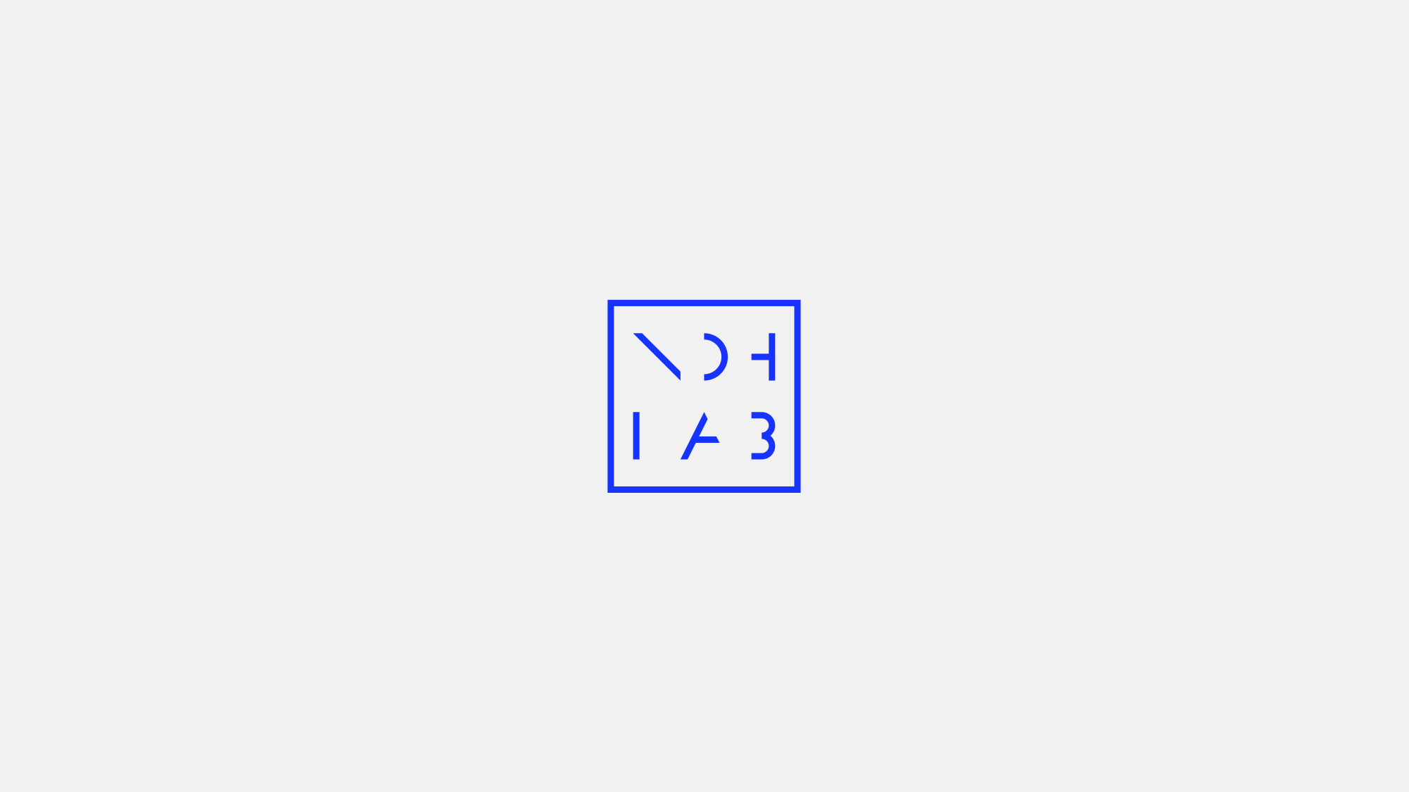
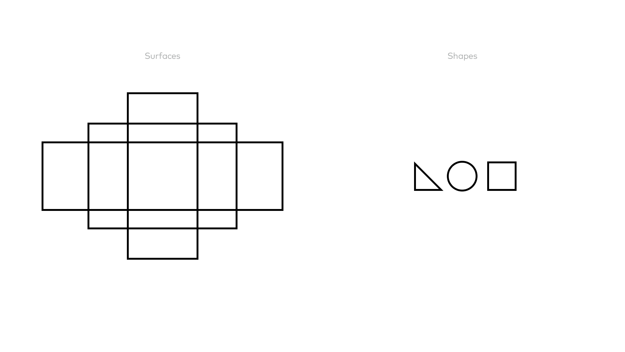
The basic geometric shapes, which are the starting point of the visual outputs produced, reflect the simplicity in what seems to be complex. These shapes turn into letters and these letters form their own pattern and multiply themselves.
We believe in a rational design process where decisions are based on objective reasons that emerge from the project brief and that can be articulated in meaningful and productive discussions.
More about us & our approach →
To discuss a project or collaboration feel free to get in touch.
fevkalade[at]fevkalade.net
All work © 2024 Fevkalade.